Side by Side Website Budget Comparison
The Most Value for Your Money

In the wild world of the internet, the cost of a website can soar as high as your ambitions or sink to the depths of cut corners and chaos. We’ve laid out a comparative journey across 3 landscapes: the high-end agency marvel, our own meticulously crafted bespoke website, and the tumultuous terrain of a confusing experience. This is an exploration of value, vision, and the vital role of a website that truly resonates with its audience. It’s about understanding the worth of your digital footprint without being tethered to exorbitant costs or lost in the labyrinth of low investment. Let’s navigate this together.
Mobile First Design:
Easy Navigation
Clear Call to Action
Minimal Text
Budget:
Video – worth it?
Cost vs. UX
Building for the customer
Current customers vs. new customers
Desired actions
Site flow
The High End Marvel
Orange Theory’s website exemplifies strategic brand and design strategy. Every feature, button and call to action are thoughtfully placed. This site promises a smooth navigation experience. If reflects the brand’s comprehensive approach, from its physical studios to digital footprint. On this website, visitors are effortlessly directed to their desired destination.
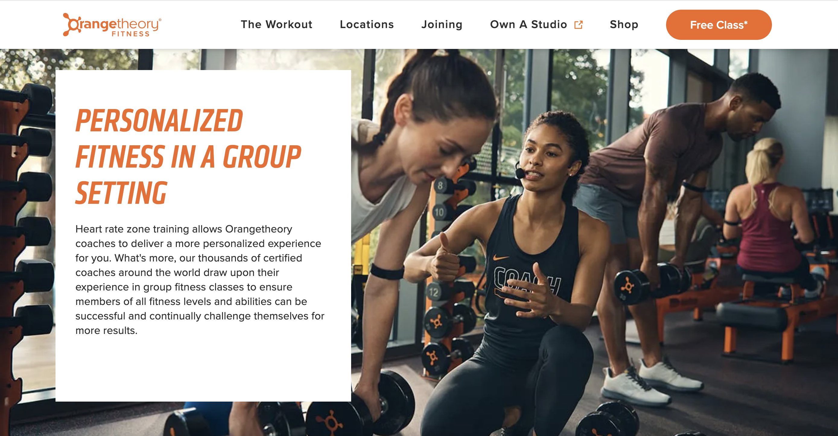
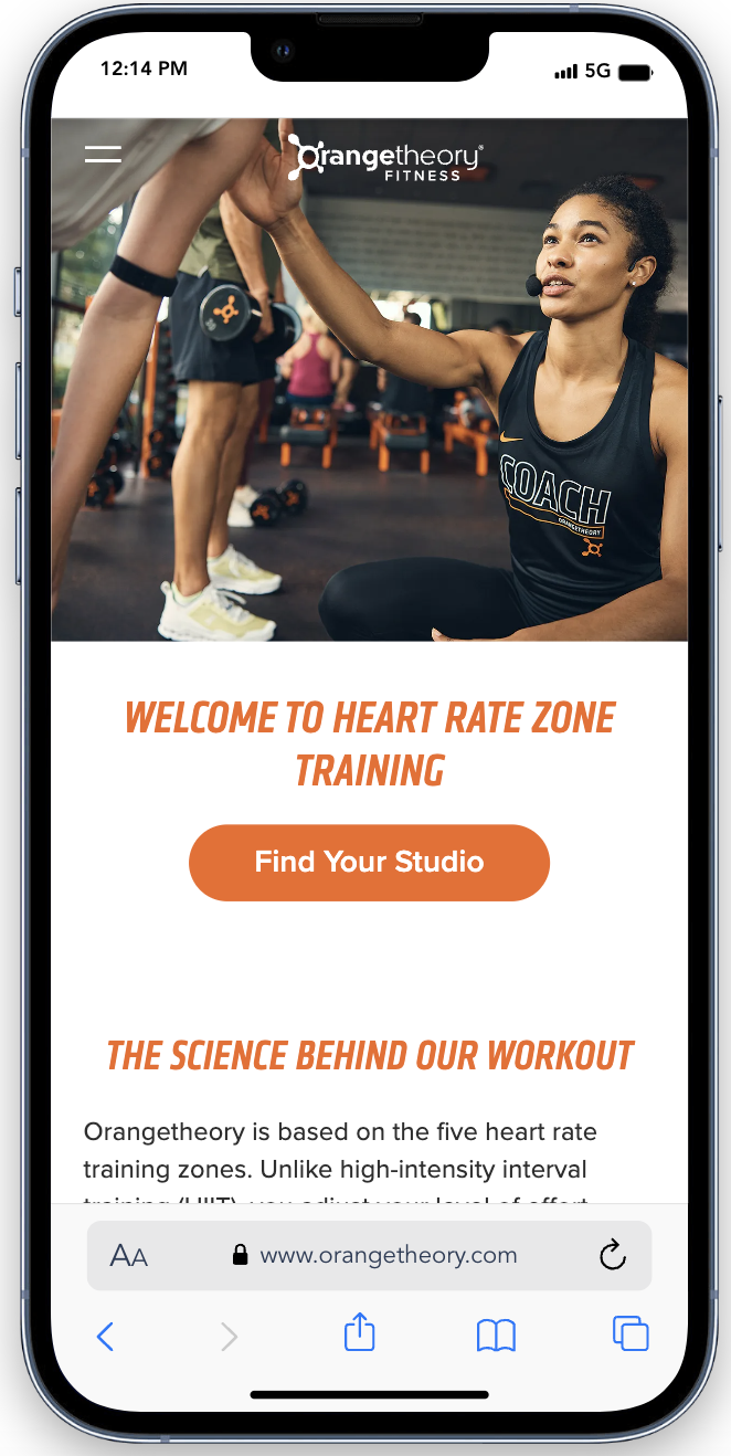
Key Features
- Price: 💲💲💲
- Smooth Navigation
- Strategic Experience
- Brand Coherence
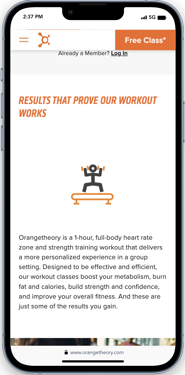
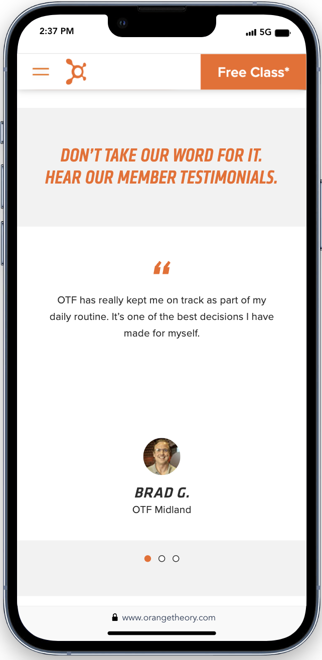
Animated Elegance and Testimonial Clarity
Orange Theory’s mobile site shines with scrolling animation demonstrating meticulous care in its digital presence.
Its testimonials, perfectly sized and not overly distracting, occupy their own space, making them geuninely engaging. This design choice cleverly avoids the common pitfall of overcrowded testimonials.
Summary Cards
Budget-💰💰💰
Orange Theory’s website represents a high end investment, where the budget aligns with the brand’s ambition for digital excellence.
Design
The design is a harmonious blend of aesthetics and functionality capturing the brand’s vibrant energy.
User Experience
For the user, it translates into an intuitive and engaging experience, ensuring that each visitor’s journey is efficient and memorable.
Final Thoughts
Orange Theory’s website stands at the high-end marvel, showcasing strategic design and seamless user experience. While the site’s polished features underscore the brand’s commitment to excellence, the investment required reflects its premium nature. If you’re inspired by Orange Theory’s digital prowess, but seek a more accessible option, keep reading. 321Go’s bespoke websites offer similar sophistication and strategic design tailored to a more modest budget.
Ready to Design a Website That Puts Your Customers First?
Join us on a journey where creativity meets usability.
321Go’s Bespoke Website
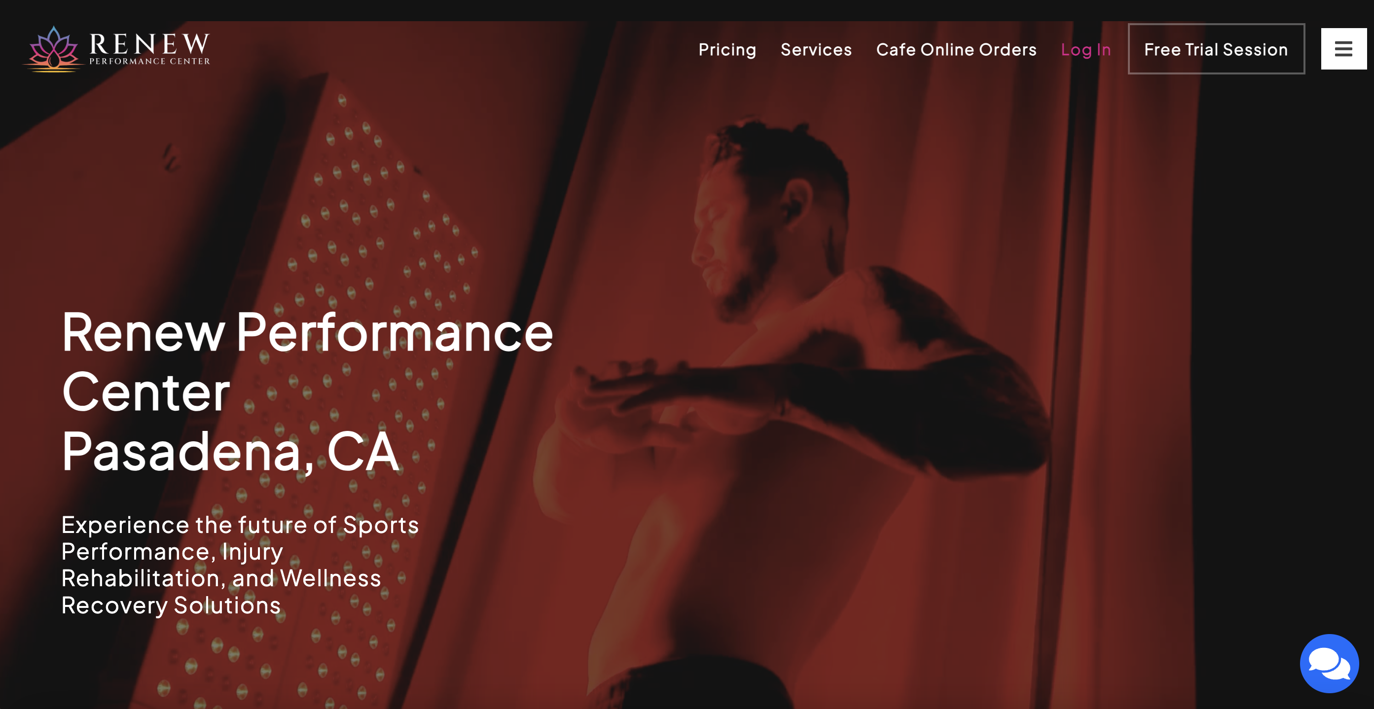
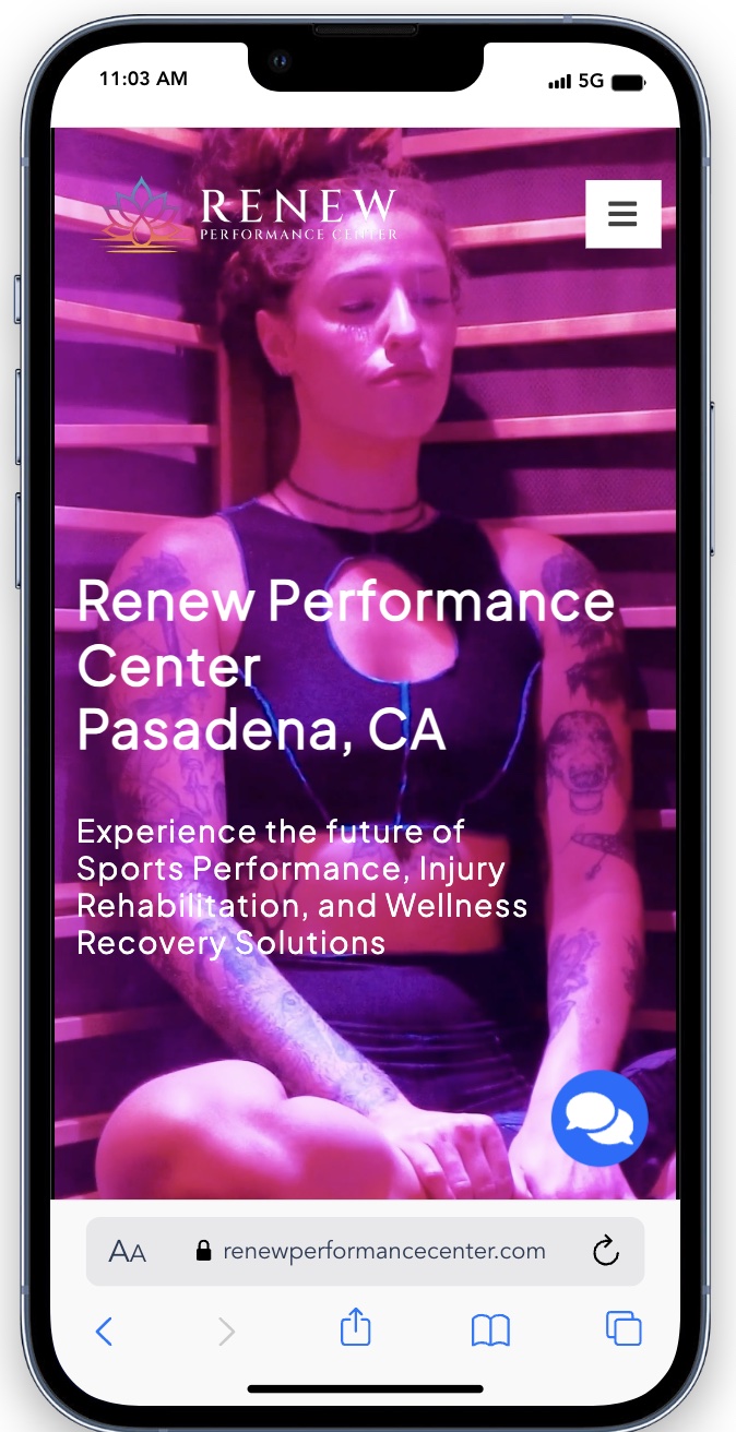
Admittedly, we’re a tad partial. But let’s take a peek at Renew Performance Center’s site, and you’ll see why. This website boasts a user-friendly interface and a sleek layout. This was all achieved at a significantly lower investment than high end alternatives. It’s proof that elegance and functionality need not break the bank, reflecting their commitment to delivering top-tier design within reach.
Key Features
- Price: 💲💲
- Intuitive Usability
- Sleek Layout
- Cost Effective
Mobile Mastery: Effortless Browsing
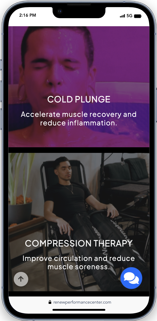
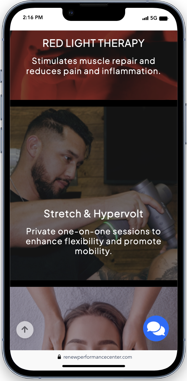
Renew Peformance’s mobile website shines with its social media-esque content. The bite-sized information and vibrant imagery ensures a smooth familiar scroll for users.
Designed for effortless thumb navigation, it keeps essential information in view without the hassle of page switching. The mobile browsing experience is optimized for speed and ease.
Summary Cards
Budget-💰💰
Renew Performance Center’s website achieves high-quality design on a budget making it more accessible than its high-end counterparts.
Design
Its design is characterized by a sleek layout that prioritizes clarity and aesthetic appeal.
User Experience
This website delivers a seamless and engaging user journey, providing easy access and interaction while leaving a lasting impression.
Final Thoughts
This bespoke website by 321Go showcases that high-quality design and functionality are achievable without the steep price tag. Its intuitive interface and sleek layout, coupled with an optimized mobile experience akin to social media, highlight our dedication to making top-tier design accessible. This site proves that elegance, efficiency and user engagment can come with cost-effectiveness.
Ready to Design a Website That Puts Your Customers First?
Join us on a journey where creativity meets usability.
The Budget Friendly Option
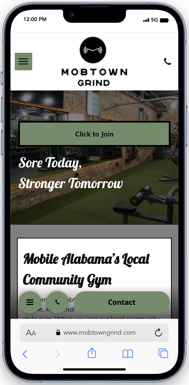
Mob Town Grind’s website is a treasure trove of information about the gym. It offers an exhaustive insight into its service and ethos. However, this abundance leads to a bewildering user experience. With a clutter of call to action buttons, navigation feels more like a maze than a journey.
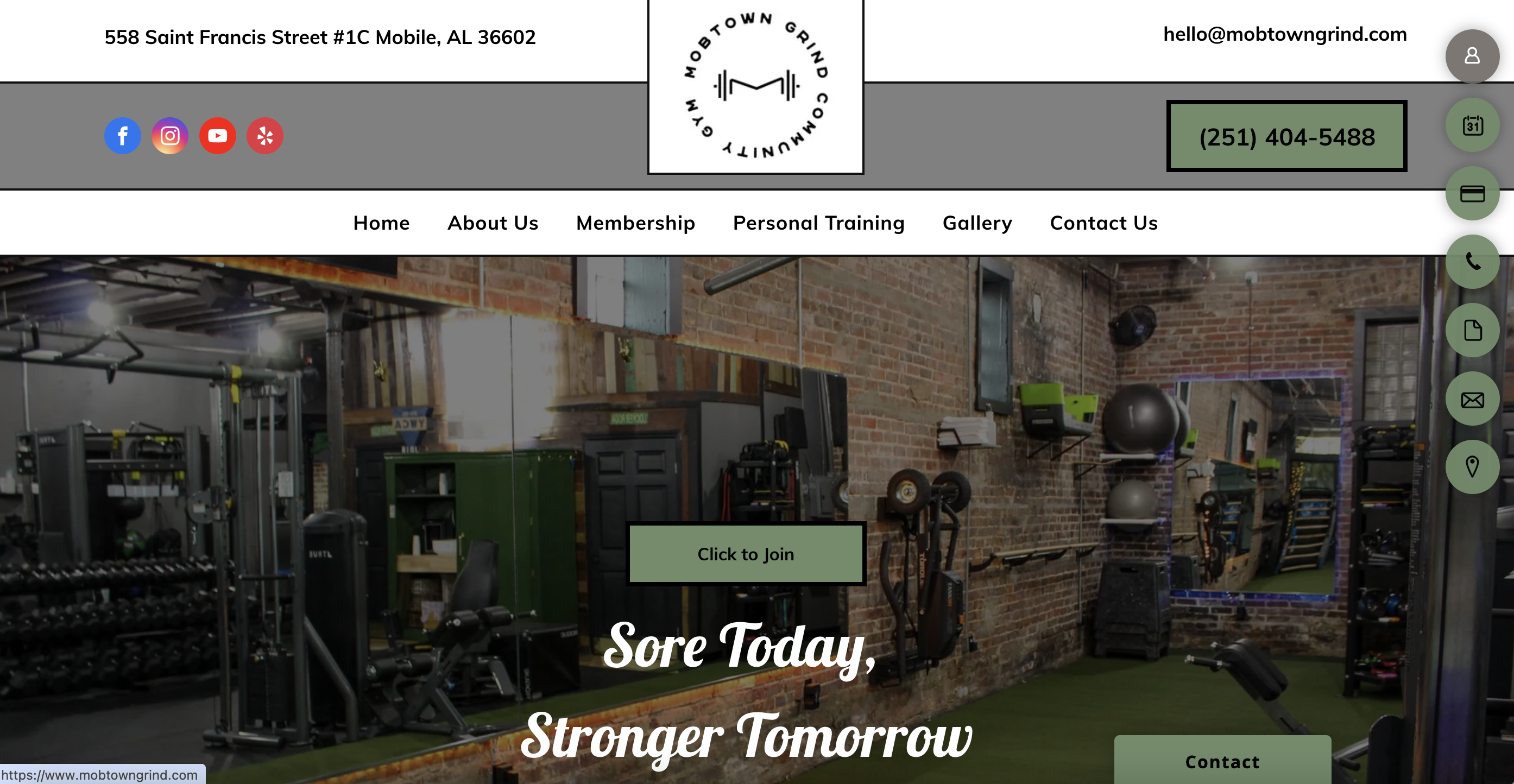
Key Features
- Price: 💲
- Comprehension Information
- Confusing Navigation
- Overwhelming Choices
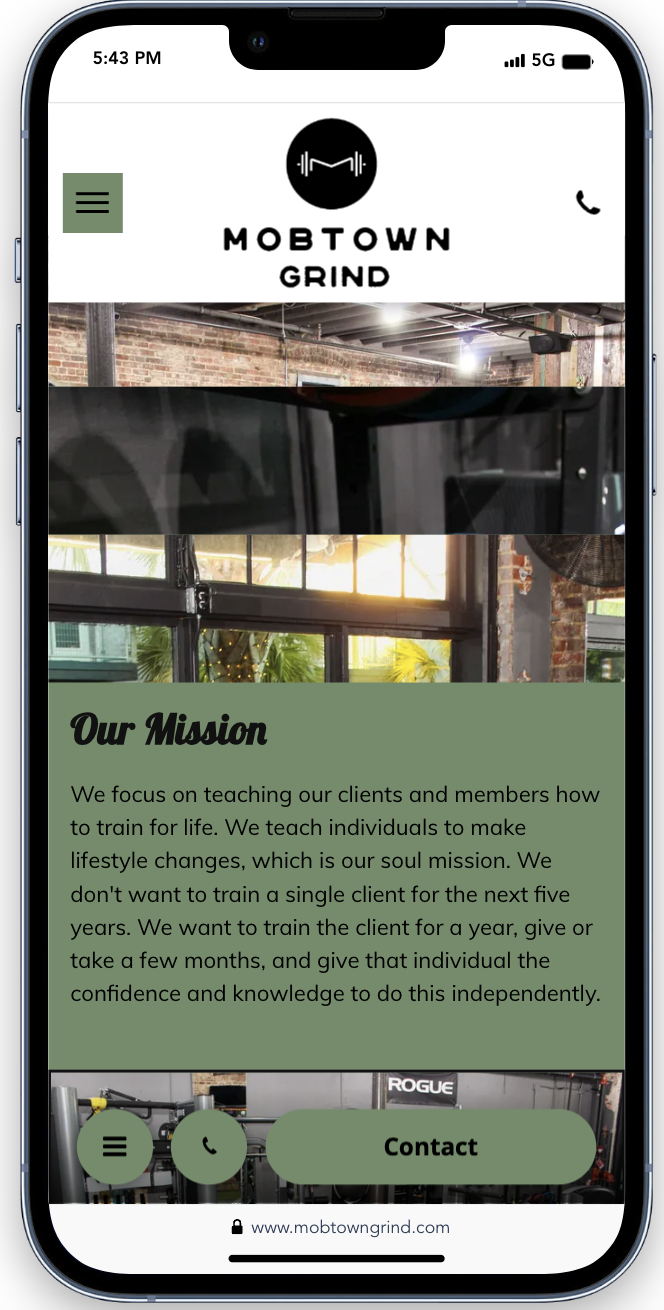
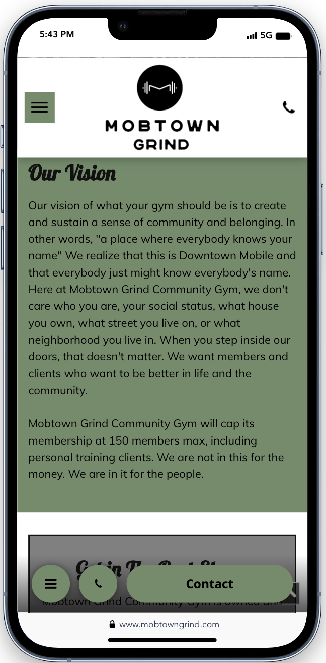
Mobile Mayhem: Navigating Through Clutter
The mobile version magnifies the desktop disorder, resulting in a bewildering experience. An excess of buttons without a distinct call to action leaves users meandering through a maze rather than smoothly exploring a website. This clutter not only muddles the user journey but also overshadows the rich information the gym aims to share.
Summary Cards
Budget-💰
This cost-effective website illustrates the classic caveat, “you get what you pay for.”
Design
The design, laden with excessive information, becomes a visual and navigational challenge.
User Experience
The user experience suffers as visitors navigate through a variety of options, struggling to find a clear path to their destination.
Final Thoughts
While Mob Town Grind offers a budget friendly approach, its website’s overwhelming complexity and confusing navigation illustrate that cheaper isn’t better. The desktop and mobile versions alike turn potential customer engagment into a daunting maze. In contrast, 321Go stands out as the clear victor among the three, balancing affordability with quality. By prioritizing user-friendly design and efficient navigation, 321Go proves that value and budget can harmoniously coexist.
Ready to Design a Website That Puts Your Customers First?
Join us on a journey where creativity meets usability.